Pixel Art on the Train
I am not an artist. I should get that out of the way up front. I’m a programmer who, through a series of events that seemed reasonable at the time, ended up being the person making all the pixel art for Tomb of the Snake King. On an iPad. On the train to work.
The original jam sprites were made by Fintan and Ellie back in 2021, using Piskel. They were great–especially for a fifteen-year-old and a 12-year old working to a deadline while I was 5,000 miles away working in Seattle. But when we rebuilt ToSK from scratch, we needed a complete new set of art to match the new design. Fintan’s doing game design in college now. Ellie’s moved on. That left me.
My qualifications: I’ve painted a lot of Wood Elf miniatures (and High Elves, and a Dark Angels army I don’t talk about as much), so I know enough colour theory to be dangerous. I know what a highlight is. I know where a wash goes. That’s about it.
The Constraints
Every sprite in ToSK is 16x16 pixels. The entire game uses Endesga-32, a 32-colour palette from Lospec. I wanted enough colours to feel retro without feeling crappy–there’s a line between “charming NES aesthetic” and “why does everything look like it was drawn in MS Paint on a 486,” and I wanted to land on the right side of it. 32 felt like the sweet spot: enough range to give each biome its own identity, few enough that everything still looks like it belongs in the same game.
I do all the art in Pixquare on an iPad. My commute is about 40 minutes each way, and that’s when the sprites get made. One enemy per train ride, give or take. Put on the headphones and pushing individual pixels around while the Dublin commuter belt rolls past the window.
The Enemy System
Each of the five biomes in ToSK has three standard enemy types that fill the same mechanical roles:
- A horizontal patroller – walks back and forth along a row. Easy to dodge, embarrassing when you walk into one because you weren’t paying attention.
- A vertical patroller – same thing, but up and down. The one that catches you when you’re focused on the horizontal one.
- A chaser – actually hunts you down. The one that keeps you moving.
The idea is that once you’ve learned how to deal with patrollers and chasers in the Tomb, you’ve got the basics for every other biome. The rest of each biome’s enemies are unique to that biome and introduce mechanics you haven’t seen before. It seemed like a natural way to do it–keep the fundamentals the same, make the specials special.
Here’s how the standard three look across the biomes we’ve finished so far:
| Role | Tomb | Jungle | Ice | Gothic |
|---|---|---|---|---|
| Horizontal | Mummy | Golem | Wolf | Vampire |
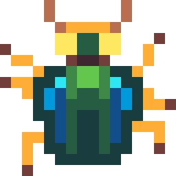
| Vertical | Scarab | Spider | Frostbite | Bat |
| Chaser | Snake | Jungle Snake | Yeti | Haunted Skull |
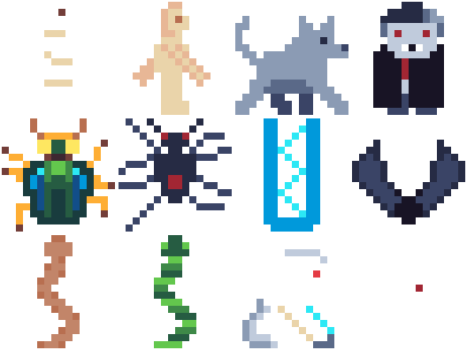
Same jobs, completely different personalities. The Mummy shuffles. The Golem stomps. The Wolf prowls (I think this one actually prances). The Vampire… does whatever vampires do (lurks?). But they all patrol left-right, and you dodge them all the same way.
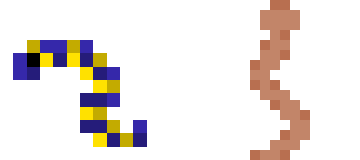
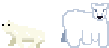
Before and After
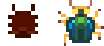
One of the nice things about having the original jam sprites still sitting in the repo is being able to compare them with the new ones. Here are a few:
The Snake went from a more worm-like look in the original to something a bit more menacing in the new version. The original was 12x12–a surprisingly restrictive (and kinda awkward) size to work in. The new one is 16x16. Both are recognisably snakes, which is honestly the main goal when you’ve got that few pixels to work with.
The Mummy was smaller in the original–the jam art was all 12x12, which is a surprisingly awkward size to work in. The new one is 16x16 with more animation frames, and I think the extra four pixels in each direction make a real difference to readability. It’s easier to suggest “wrapped bandages” when you’ve got a few more pixels to play with.
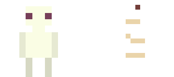
The Ghost is my favourite comparison. The original was an amorphous ghost silhouette in purple. The new one is white–and I mean white. When I first exported it, it disappeared against the white background. Turns out my ghost was so ghostly it ghosted itself. It works perfectly in the Gothic biome, though, where the levels are dark and the ghost emerges from the blackness as this pale shape with dark eyes. Happy accidents. Or maybe Fintan will pull rank and tell me it has to be a silhouette again when we really get into playtesting.

The Polar Bear had a simpler original design. The new one has three states–sleeping (complete with Zs), waking, and walking–because the bear is a 4-tile enemy that starts dormant and only wakes up when you get close. The art for this one is… fine. He looks a bit derpy. I’m keeping him anyway. He sleeps with Zs over his head and I’m not changing that for anyone.
Hits and Misses
The sprite I’m most proud of is the Scarab. I actually looked up reference footage of real beetles walking and tried to get the leg movements right within the 16x16 constraint. It’s four frames of animation and I think the movement reads well–you can tell it’s a beetle, not just a blob that scoots around. The original was darker and more menacing; the new one is greener, more “actual insect,” which fits the updated Tomb palette better.
The Frostbite is literally just a set of teeth walking around. That’s the joke. It’s a frostbite. Fintan came up with this as an enemy when designing the biomes (which we did about a year after the original jam) and when he designed the sprite for it I laughed my ass off. It stays. Dad jokes ftw!
![]()
The one I’m least happy with is the Yeti. I was going for a gorilla-walking-on-knuckles look–hunched over, powerful, lumbering. It didn’t really land. At 16x16, “hunched gorilla” and “vaguely humanoid blob” are uncomfortably close together. He’ll probably get another pass before we ship.
![]()
The Palette Story
The Tomb biome was originally blue. Blue walls, blue floor, blue everything. It looked like a cave, not a tomb. When I switched to Endesga-32 and started thinking about what “Egyptian tomb” actually looks like, the warm sandstone colours picked themselves–terracotta, amber, dark brown. The whole biome came alive.
After that, the other biomes fell into place pretty naturally. Ice is cyan and white (obviously). Jungle is deep green and dark brown. Gothic is purples and dark greys. Each one has a distinct identity at a glance, and they all pull from the same 32-colour palette, so nothing clashes when you see them side by side.
I won’t pretend I planned it all out in advance. I picked a palette that had good range, named the biomes, and the colours sort of assigned themselves. Sometimes constraints do the design work for you.
One Sprite Per Train Ride
There’s still work to do–the Lava biome needs its full art pass, and a few of the existing sprites (looking at you, Yeti) could use another go. But the pipeline is working: draw on the train, sync to the dev machine, test in-game by evening. It’s not a professional art workflow. It’s a dad with an iPad and forty minutes of rail time. But it’s getting the job done, one sprite at a time.
Got thoughts? Discuss this post on our Discord.